Led the product design for a 384-page website redesign for a Chicago window tinting company. Strong organic rankings were driving traffic, but the site was failing to convert it, and every page had SEO value that couldn't be risked. I designed the core booking flows, service catalog, and UI components while leading design direction across a cross-functional team of 12 (engineering, SEO, PM, and an outside agency). +54% conversion rate, -31% bounce rate, all top keyword positions maintained.
" height="1px" id="eqmcWiMUn" stroke-dasharray="0" stroke-linecap="round" stroke-linejoin="round" stroke-width="1" stroke="rgb(170, 170, 170)" width="958px"/></svg>)
12 people
1 year
Tinting Chicago
UX Research & Strategy · Information Architecture · Art Direction · UI Design & Prototyping
The problem
Built for Google, Not for Customers
Pre-redesign analytics told the story: The site was bringing in high-intent visitors and losing them. Most customers never found the quote form at all.
Tinting Chicago had been investing in SEO for years, and it worked. The site ranked #1-3 for most of its target keywords, and organic search was the primary source of new customers. But the site was structured around how Google indexed content, not how customers looked for services.
Every page had ranking value, so we couldn't delete pages, couldn't consolidate freely, couldn't restructure URLs without SEO review. The information architecture had to be rebuilt for humans while keeping every page's search equity intact. Across 384 pages. That tension between what customers needed and what SEO required shaped every decision that followed.
BEFORE
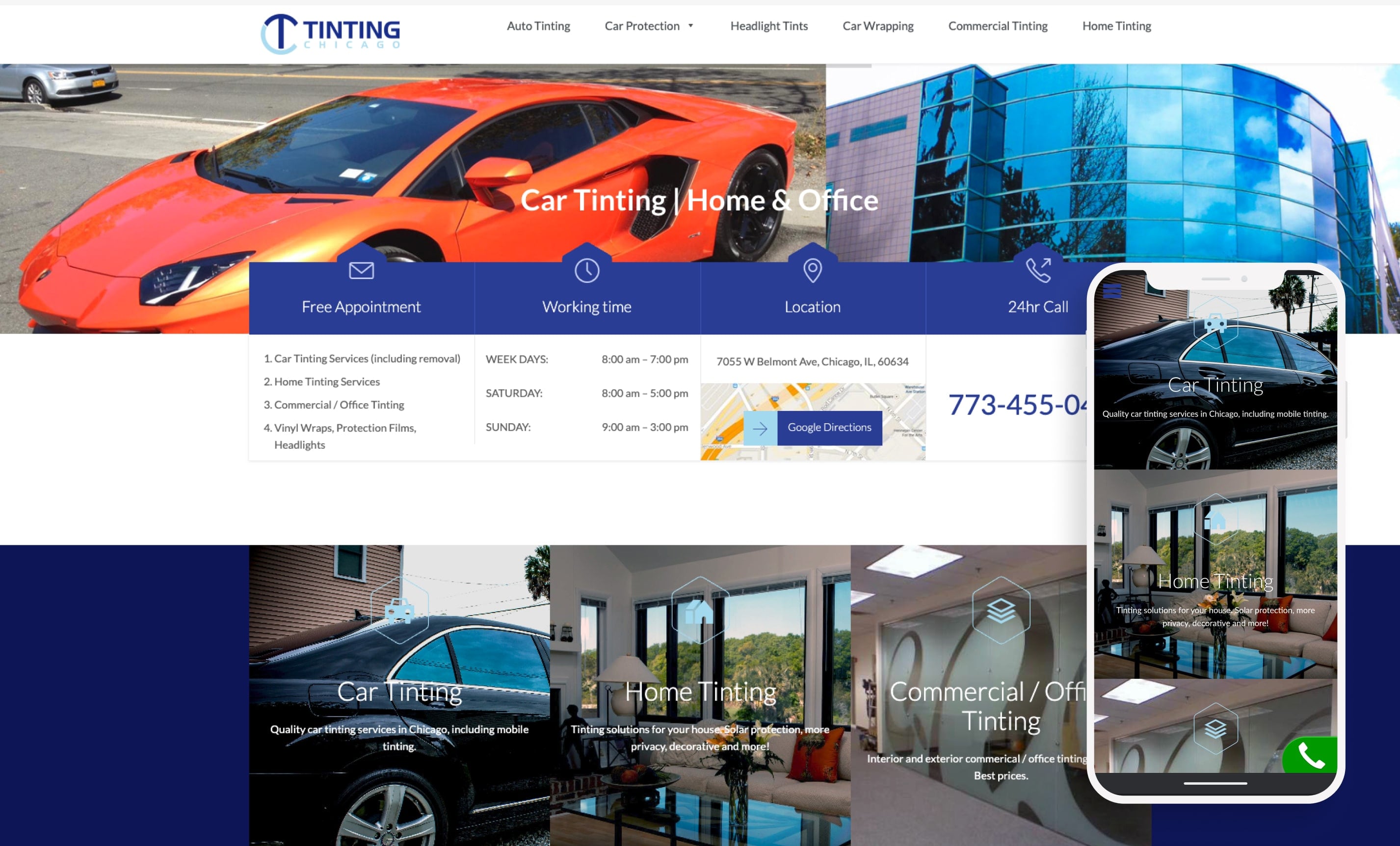
The old homepage gave visual prominence to tinting, home, and commercial services but wrapping, PPF, and headlights shared a single text line
AFTER
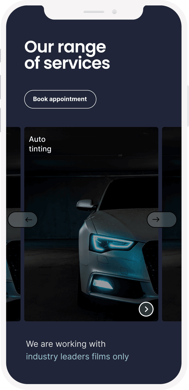
Redesigned homepage with service catalog, categorized navigation, and the 3D explainer video above the fold.
Research
Customers Wanted to See, Not Read
A customer survey made the core problem clear: 75% of customers said their main motivation was how the result would look. The existing site was built around film specifications and technical features. The mismatch between what customers wanted to see and what the site was showing them explained most of the conversion gap.
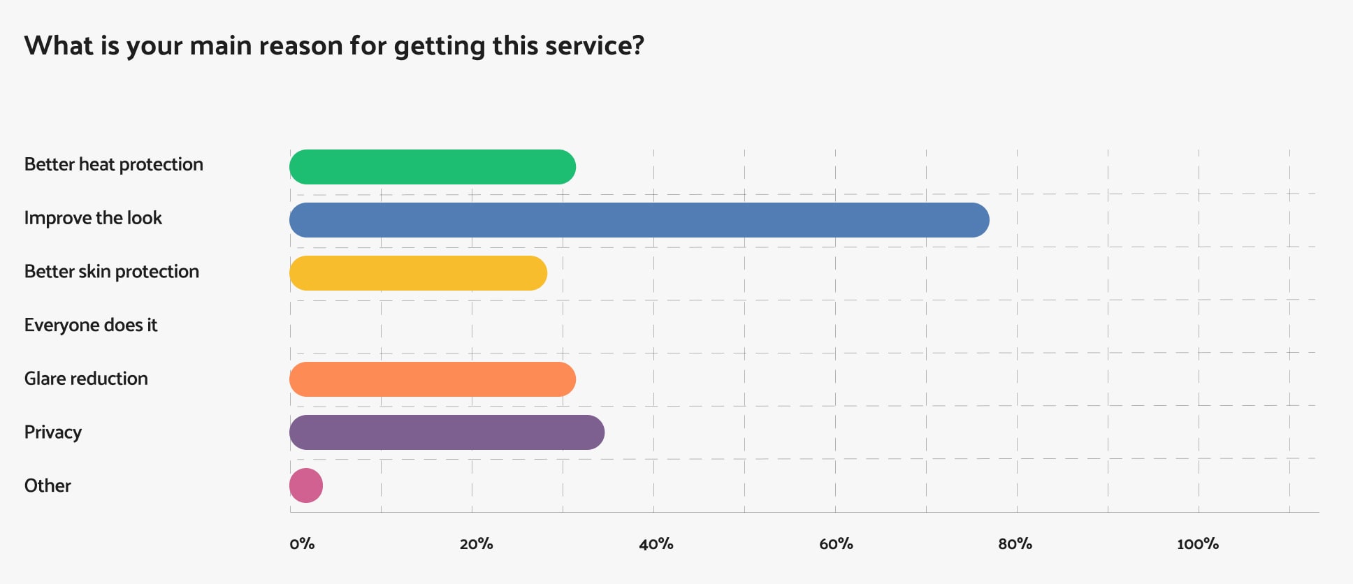
75% of customers came for aesthetics first, explaining why text-heavy spec pages weren't converting.
(200+ check-in responses, multi-select)
I spent time at the store's location working the sales floor myself, walking customers through film options, explaining percentages, and answering their questions directly. That gave me firsthand experience with what customers actually asked for, how they processed explanations, and where they stalled.
What I saw repeated: customers were getting more technical information than they could process, and the price conversation was happening before they'd had time to compare options. There was no way to see the differences between films in the store.
When a customer asked what a specific tint percentage would look like, staff would walk outside to the parking lot to find a car with matching tint, or pull up Google Images on their phone. That was the workaround for a problem nobody had solved digitally, and it became the starting point for the visualizer.
The one thing customers responded well to was a tablet set up in the store where they could browse film options and percentages without sales pressure. They spent time with it, compared options on their own terms, and came back to the sales conversation more confident. That's where the idea for the online visualizer came from.
Staff interviews confirmed the same pattern, adding that they also had to flag which tint levels were legal in the state, another layer of complexity the website wasn't addressing.
Information Architecture
Reorganizing the Site Around How Customers Think
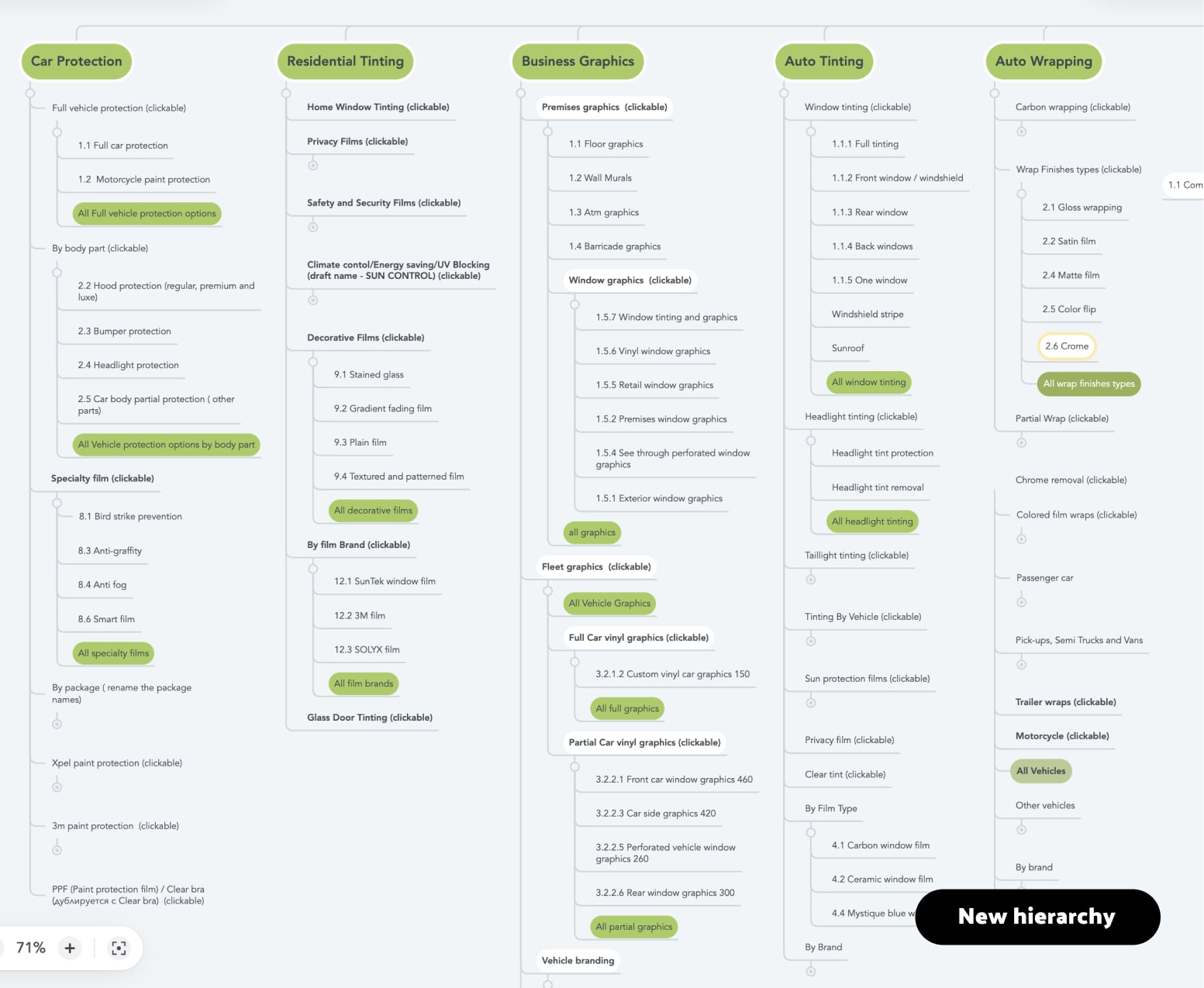
Restructured sitemap. Green highlights new landing pages.
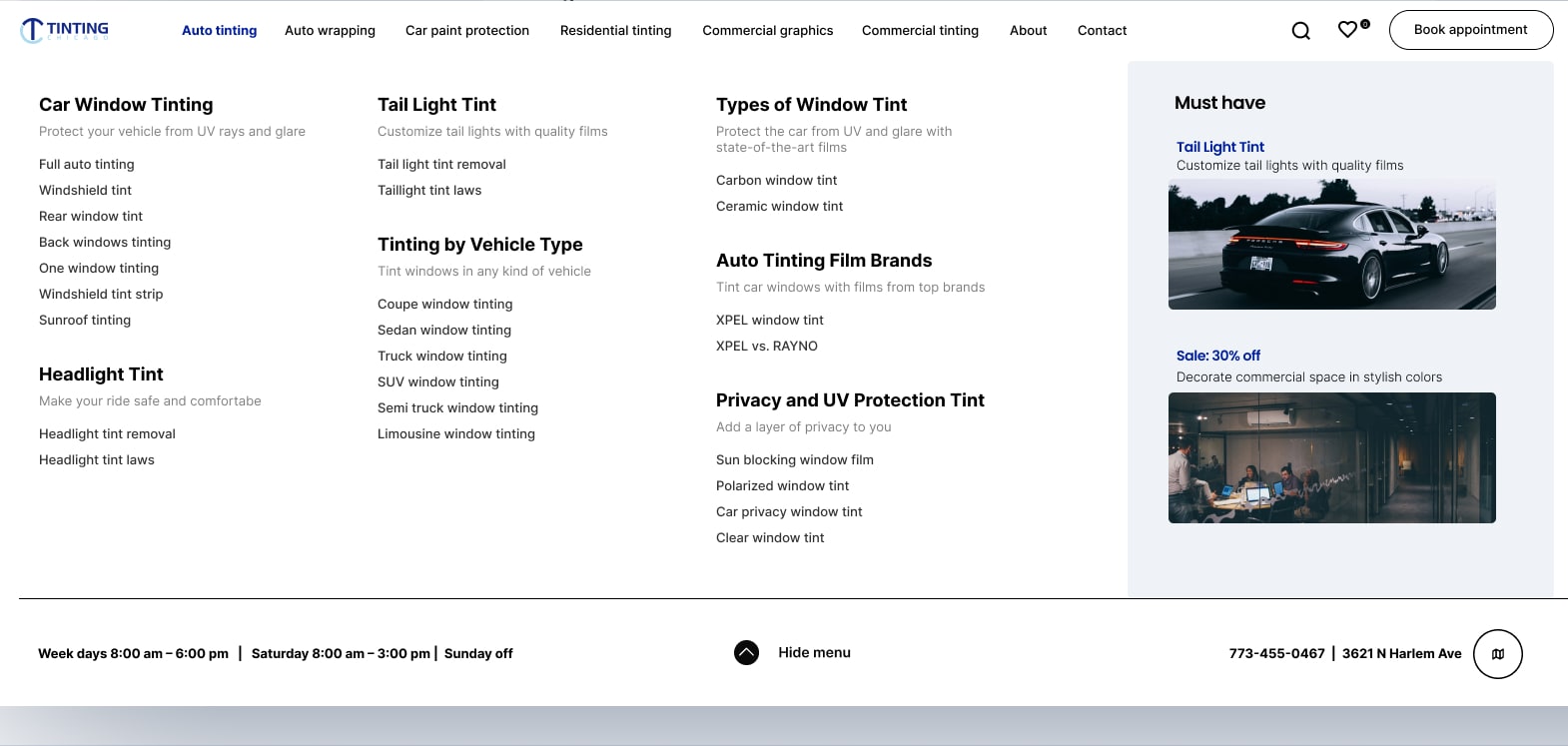
Auto Tinting mega-menu, redesigned. Pages reorganized into task-based groups with descriptions
The restructuring had to satisfy all audiences. For customers, the new taxonomy organized services by intent. For Google, every existing URL kept its ranking value. The solution was aggregation landing pages that sat above the existing deep pages, giving customers clear entry points without deleting or redirecting the content Google was already rewarding. The old pages stayed in the index. The new pages gave humans a way to find them.
I also worked with the SEO team to map high-intent search queries to article templates designed to turn bouncing organic traffic into visitors who stayed and explored services.
Tree testing with the new structure showed customers found services significantly faster. All #1-3 keyword positions were maintained through the migration.
Design Decisions
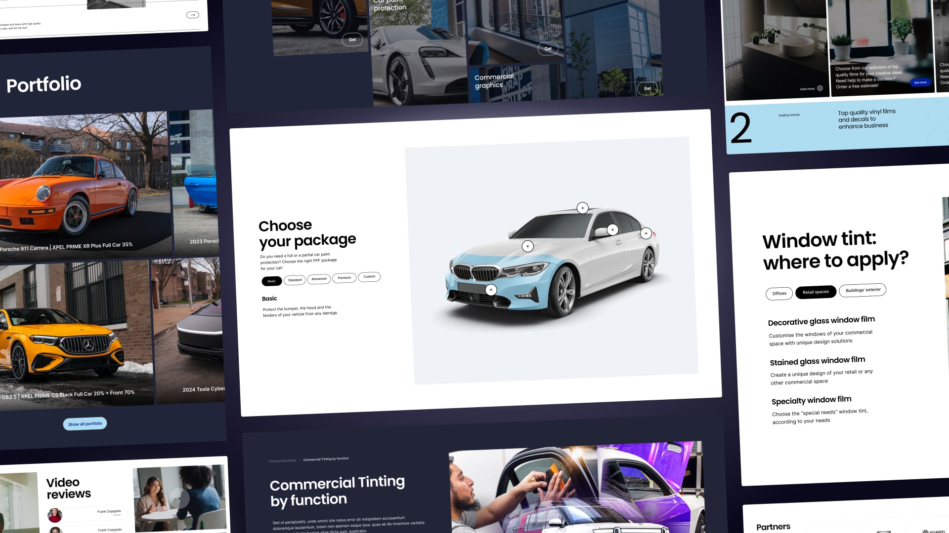
Making Services Something Customers Could See for Themselves
The research pointed in one direction: every tool on the site needed to show customers what they'd get, not describe it in text.
1
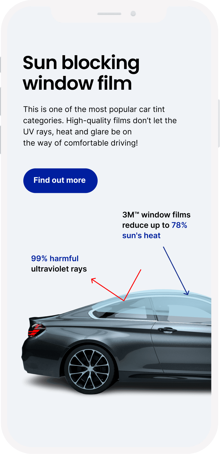
Showing what the numbers actually mean
The simpler option was better photography with percentage labels. But the research showed something specific: customers didn't just want to see examples, they fundamentally misunderstood what the percentages meant. They assumed 20% meant 20% darkness applied. In reality, it means the film only lets 20% of light through, which is quite dark. A label saying "20% tint" next to a photo wouldn't fix that misunderstanding. The interactive tool let customers move between percentages and see the change happen on a car image, correcting the mental model in a way static images couldn't. It was built as a lightweight overlay on static images, so the page stayed fast and crawlable.
The portfolio section worked from the other direction. Every photo of completed work was labeled with the exact film and percentage used. Customers could browse real results, find a look they wanted, and know precisely what to request.
Customers assumed 20% meant 20% dark. The tool shows what each percentage actually looks like.
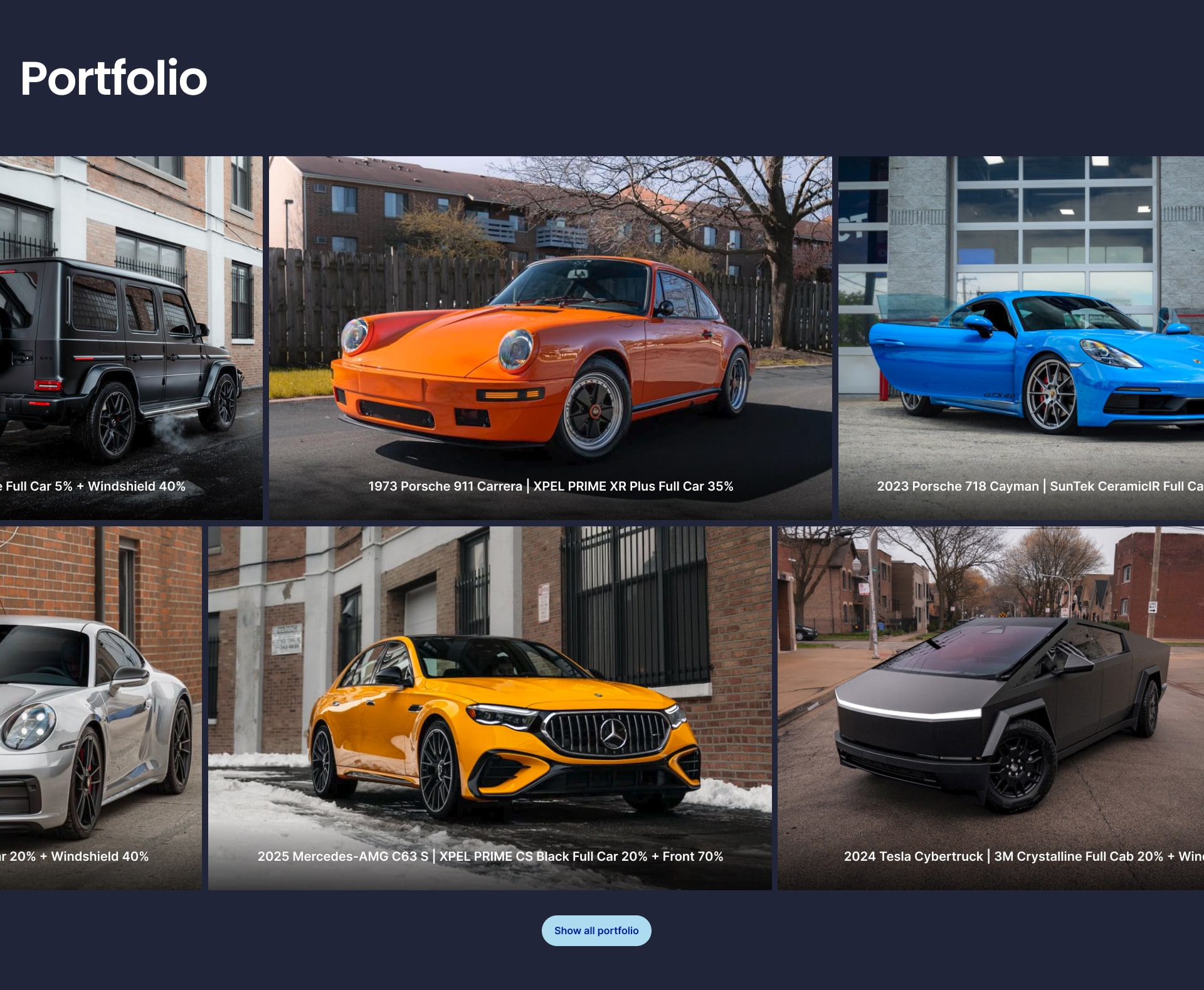
Real results labeled with exact specifications, so customers know precisely what to request.
2
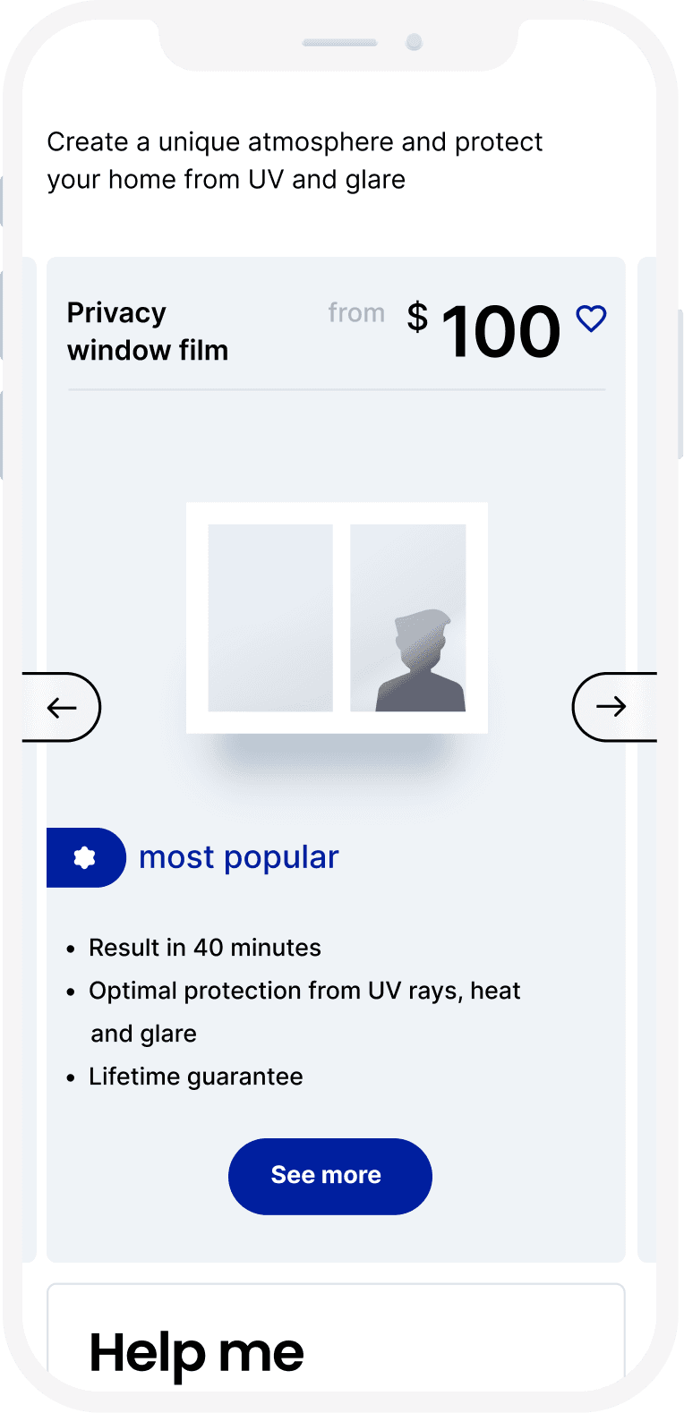
Transparent pricing where it hadn't existed online
The business already had printed price sheets with clear categories for standard services like auto tinting. Putting those online was straightforward. The harder part was complex services like wrapping, PPF, and commercial work, where pricing varies significantly by project. From customer interviews and staff feedback, we knew most customers had no idea what these services cost, and many dropped off after their first call when they heard the number. We added baseline pricing for these services to set expectations upfront. Some customers would see the price and leave, but that was ok: the site filtered for customers who were ready to buy instead of generating leads that went nowhere. Putting real prices on the page had an SEO benefit too: post-launch, the pages started ranking for price-intent searches that the old "call for quote" model couldn't capture.
The service catalog showed package cards with top-down car illustrations showing exactly which parts were included. For customers who still wanted guidance, a "Help me choose" card with staff photos and call/chat options sat alongside the self-serve packages.
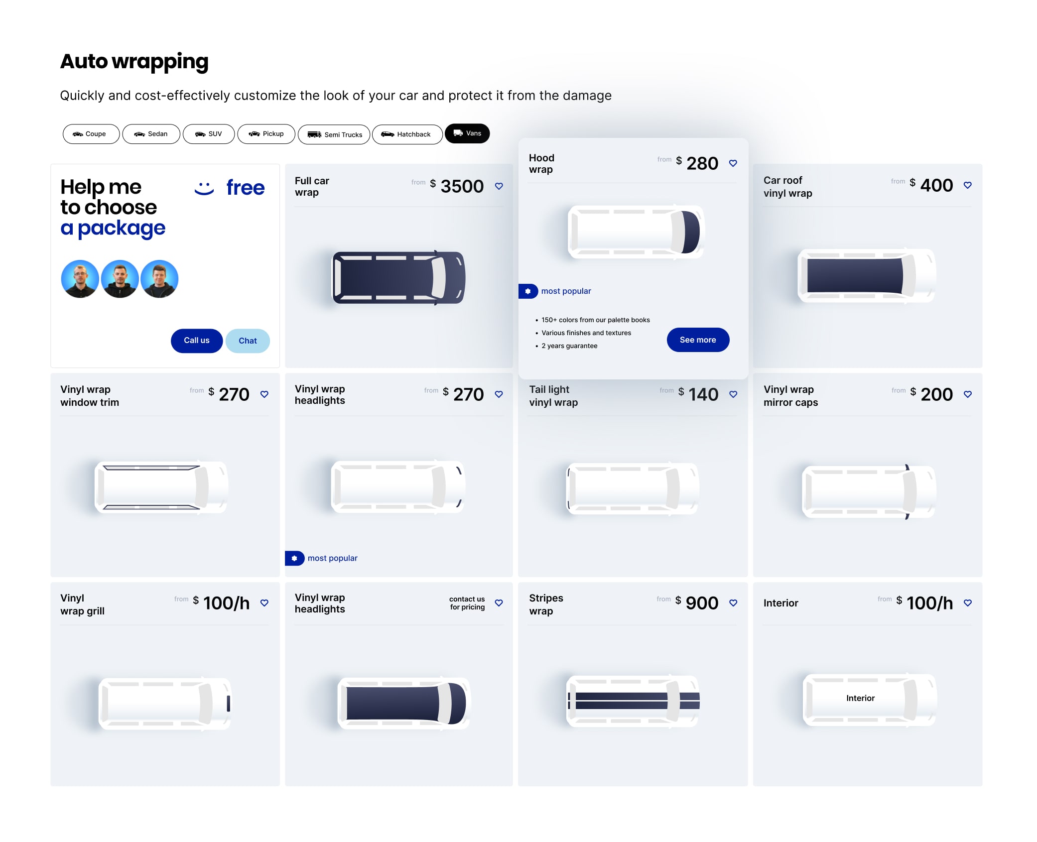
Top-down illustrations show exactly parts are covered. Transparent pricing replaced "call for quote." The "Help me choose" card preserves human guidance alongside self-service.
3
The intro video
We considered covering the service range with static photos from multiple angles. But the custom 3D video shows tinting, wrapping, and paint protection applied to the same vehicle, then transitions to commercial and residential tinting, all in about 30 seconds. It communicates the full scope of services faster and more clearly than scrolling through separate images would. I wrote the script, drew the storyboards, and directed a freelance 3D motion designer through production. The final asset was embedded as a lightweight video loop to keep page load fast and SEO-friendly.
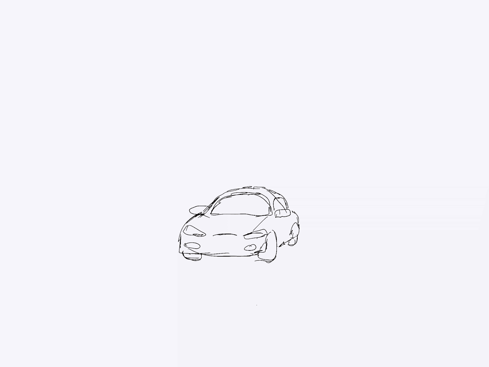
Sketches I drew to plan the video covering all service types.
The final 3D asset communicates the full scope of services in ~30 seconds.

Mobile screens: sub-blocking film detail, range of services, mobile service catalogue with pricing visible, and gift card options.
Testing & Iteration
Testing That Changed the Design
I ran multiple rounds of usability testing before the full build, and tracked metrics after each change shipped.
The site had a persistent call button, but the appointment booking option was only accessible through the menu. 5 of 8 test users never found it. I added appointment booking to the sticky bottom bar alongside the call button. Mobile quote requests increased significantly.
"Ceramic IR" and "Carbon Film" meant nothing to people outside the industry. Customers hesitated because they couldn't tell which option was right for them. I pushed for plain-language benefit subtitles under each service name: "Maximum Heat Rejection," "Best Value."
Customers browsed the gallery and liked what they saw, but kept asking "what tint shade is that?" There was no way to connect a photo they liked to a specific product. I added overlay labels with the film type and percentage on every gallery image. Customers could now go from a photo they liked to a quote for the exact same service.
PRODUCTION
Art Direction and Engineering Handoff
Directing the agency and QA through launch
I did the initial design explorations, then handed the agency annotated Figma files and a visual guidelines deck covering every page type. We were in constant communication reviewing whether the direction was right. When their output drifted from the design intent, I flagged specific corrections with annotated screenshots and side-by-side comparisons of the Figma file versus the live build. Across service category pages, I caught catalog card sizes, icon styles, and spacing drifting from the established system. Each deviation was small, but across hundreds of pages, inconsistencies would have undermined the coherent experience we'd built.
Original assets at scale
I directed original photography and video production since competitors all used the same stock imagery, resulting in over 1,000 assets. I then built a searchable taxonomy by service type, vehicle model, and tint shade so the team could find and place the right visuals across all 384 pages without bottlenecks.
RESULTS
What happened after launch
Measured three months post-launch against the pre-redesign baseline.
54%
More visitors completing quote requests and booking appointments.
31%
Customers exploring services instead of leaving from the page they landed on.
43%
Customers spending more time with the visualizer and service pages rather than bouncing from the landing page.
#1-3
All top rankings preserved through the migration. The SEO constraint was met.
Reflection
What I took away from this project
The hardest part of this project was that every design decision had two audiences. A change that made the site clearer for customers could cost a keyword ranking that took years to build. A page structure that SEO needed could confuse someone trying to book an appointment. I spent more time in this project negotiating between those two forces than I did in any design tool. The thing that made it work was bringing test data to those conversations instead of opinions. When I could show the SEO team that card sorting with real customers produced a structure that preserved their URLs while cutting task completion time, the conversation shifted from "we can't change this" to "how do we implement it."
What I'd do differently
Connect the visualizer directly to booking. Once a customer found the percentage they wanted, they still had to navigate to a separate page to request a quote. Building the booking step into the visualizer flow would have captured customers at the moment of highest confidence.
Give residential and commercial their own research. The automotive experience got the most design attention because it was the largest revenue line. Residential and commercial used the same patterns adapted from automotive, which worked but wasn't ideal. A homeowner choosing privacy film has different needs than a car owner picking a tint shade. Those sections deserved their own discovery work.
Instrument the individual tools. We measured overall conversion lift, but I didn't push to track which tools were actually driving bookings. Knowing whether the visualizer or the portfolio contributed more would have helped prioritize post-launch improvements.

Product Design
Research
B2B
Wholesale
Designed a wholesale portal that scaled ordering beyond phone capacity – 100+ dealerships now self-serve. The program scaled without adding headcount.

Product Design
Development
Nonprofit
Designed and built a donation platform in 4 weeks during active crisis response — $500K+ processed, 4-year donor retention.
