Designed and built a donation platform solo for a Ukrainian humanitarian nonprofit that had 3,500 people ready to donate and no infrastructure to accept payments. $500K+ in donations processed, 1,500+ unique donors, platform still operational 4+ years later (early 2026).
" height="1px" id="eqmcWiMUn" stroke-dasharray="0" stroke-linecap="round" stroke-linejoin="round" stroke-width="1" stroke="rgb(170, 170, 170)" width="958px"/></svg>)
Product Designer
+ no-code implementation
Solo
4 weeks to functional platform
Help Razom
Information Architecture · UI Design · No-Code Implementation · Content Strategy

Help Razom formed on February 26, 2022, two days after Russia's full-scale invasion of Ukraine. Within 48 hours, 3,500 people joined a Telegram group asking how to donate. The organization had volunteers, urgency, and a community ready to act, but no website, no payment system, and no nonprofit status. I volunteered as the sole product designer.
Designing for trust
Earning donor confidence without a track record
The first donation page got shipped on Square Online in a week and was a bare-bones storefront with a single "Donate" button and no information about where the money would go. It worked for the Telegram community that already knew the organizers personally. But Help Razom launched before its 501(c)(3) status came through, and donors outside that inner circle had no reason to hand money to an organization with no track record, no official nonprofit designation, and a website that looked like it was thrown together overnight.
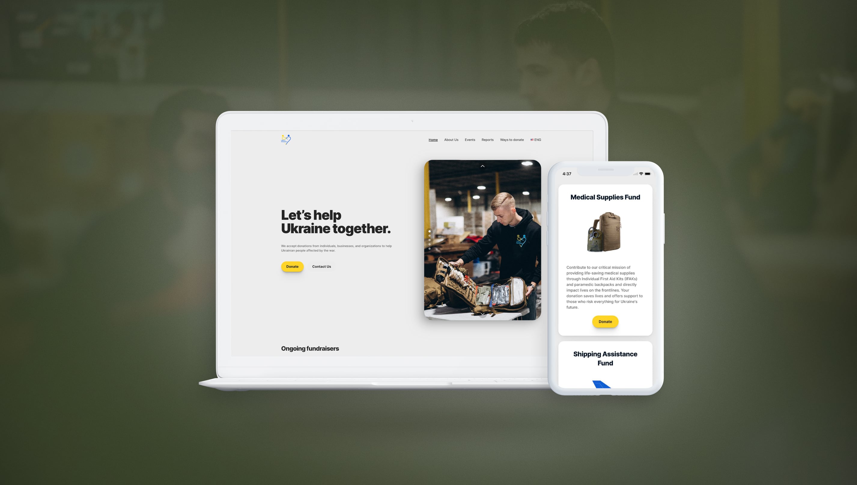
Campaign cards that show exactly where money goes
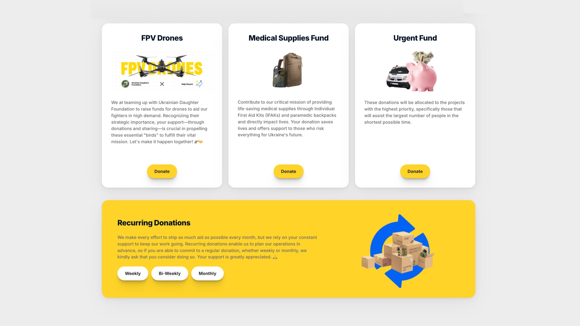
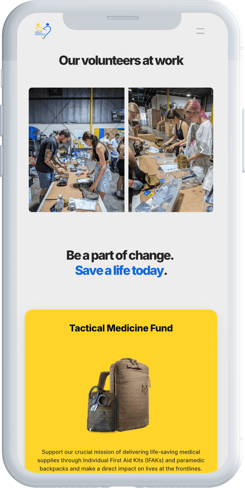
"Where does my money go?" came up at every packing event and repeatedly in Telegram. Not everyone wanted to donate to the same thing. Some wanted to fund medical aid kits specifically, others understood that logistics was expensive and underfunded, others wanted to contribute to urgent response. The first change was separating campaigns so donors could give to the cause they cared about, each with its own card and checkout. Later, I built per-fundraiser progress tracking (with AI-assisted code that pulls live totals) so donors could see how close each fundraiser was to its goal. Donations tended to pick up as campaigns got closer to completion.
For Medical Aid, the organization's largest initiative, I worked with the org's leadership to figure out what business donors would need to see before committing to a medical supply partnership. The answer was specifics: a photographic proof of assembly and delivery and the transparency on what does in each IFAK kit (brands like North American Rescue and Tasmanian Tiger). I built a dedicated page that lays all of that out so the team could send potential partners to a single URL rather than trying to explain it over the homepage.
Each campaign has its own card and donate button. Donors see exactly what they're funding.
Medical Aid page built for B2B pitches. The fundraiser card is immediate proof the initiative delivers.
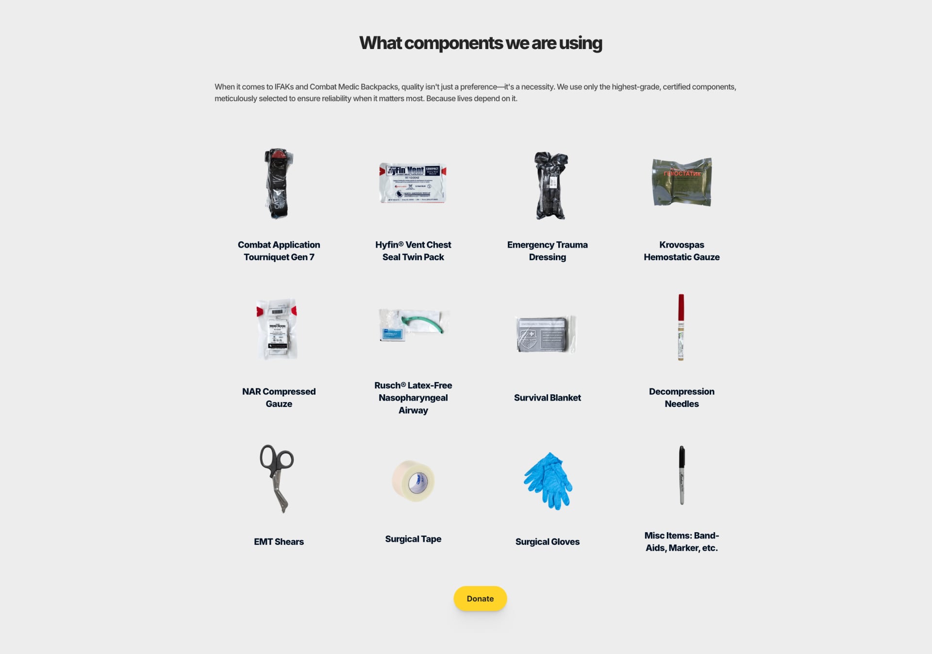
Component grid showcasing specific brands, items, photographic proof. A donor can see exactly what their contribution funds.
Every design change on this project came from the same three sources: donors asking questions in the 3,500-member Telegram group, conversations at in-person packing events, and donation patterns in the dashboards. The feedback loop was fast because the community was vocal and the payment data was immediate.
Delivery reporting that runs on zero maintenance
Donors need proof that aid actually arrives. The founders originally wanted a blog section on the site for posting delivery updates. We built it, and within a few weeks the content was already stale. The existing volunteers were stretched thin and couldn't take on website updates on top of their other work. Meanwhile, the social media team was consistently posting delivery photos and videos to Instagram and Facebook.
Instead of fighting that pattern, I replaced the blog with an Instagram embed on the Reports page. Now when volunteers post delivery documentation to Instagram, the site updates automatically. I established the posting format the team follows: what was sent, which unit or hospital received it, and photographic confirmation. The reporting channel stays current because it runs on behavior the team was already doing, not behavior I wished they'd adopt.
Offline, the organization ran public packing events and IFAK assembly workshops where anyone could show up and see the operation firsthand. I handled how these events were presented on the site and social channels.

Reports page embeds the Instagram feed. Volunteers post delivery documentation to social, and the site updates automatically.

Public packing sessions and IFAK workshops: anyone skeptical could come see the operation firsthand.
Building credibility after 501(c)(3) came through
Once the 501(c)(3) status came through, I added credibility signals aimed at different audiences. The About Us page shows the team with real photos and the Platinum Transparency badge from Candid. The Partners page lists organizations like North American Rescue and Proforce Equipment Inc. Each page addresses a different trust concern depending on who's looking: individual donors want to see real people, corporate partners want to see established relationships.
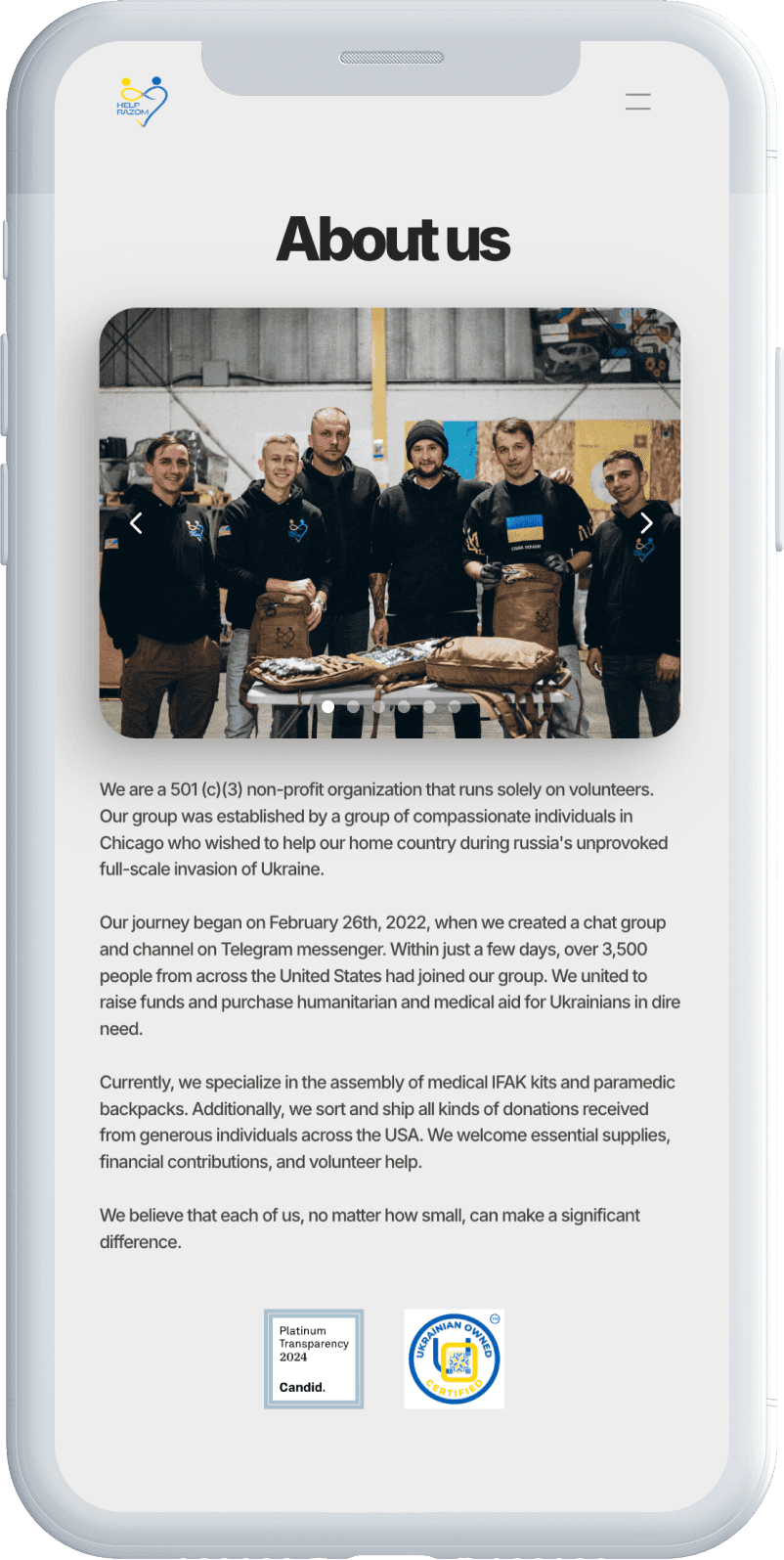
Trust signals for first-time donors: team photo, Platinum Transparency badge, and clear origin story.

Partner cards provide third-party validation for corporate donors and organizations evaluating collaboration.
Volunteers at IFAK workshops: anyone can come and assemble the kits.
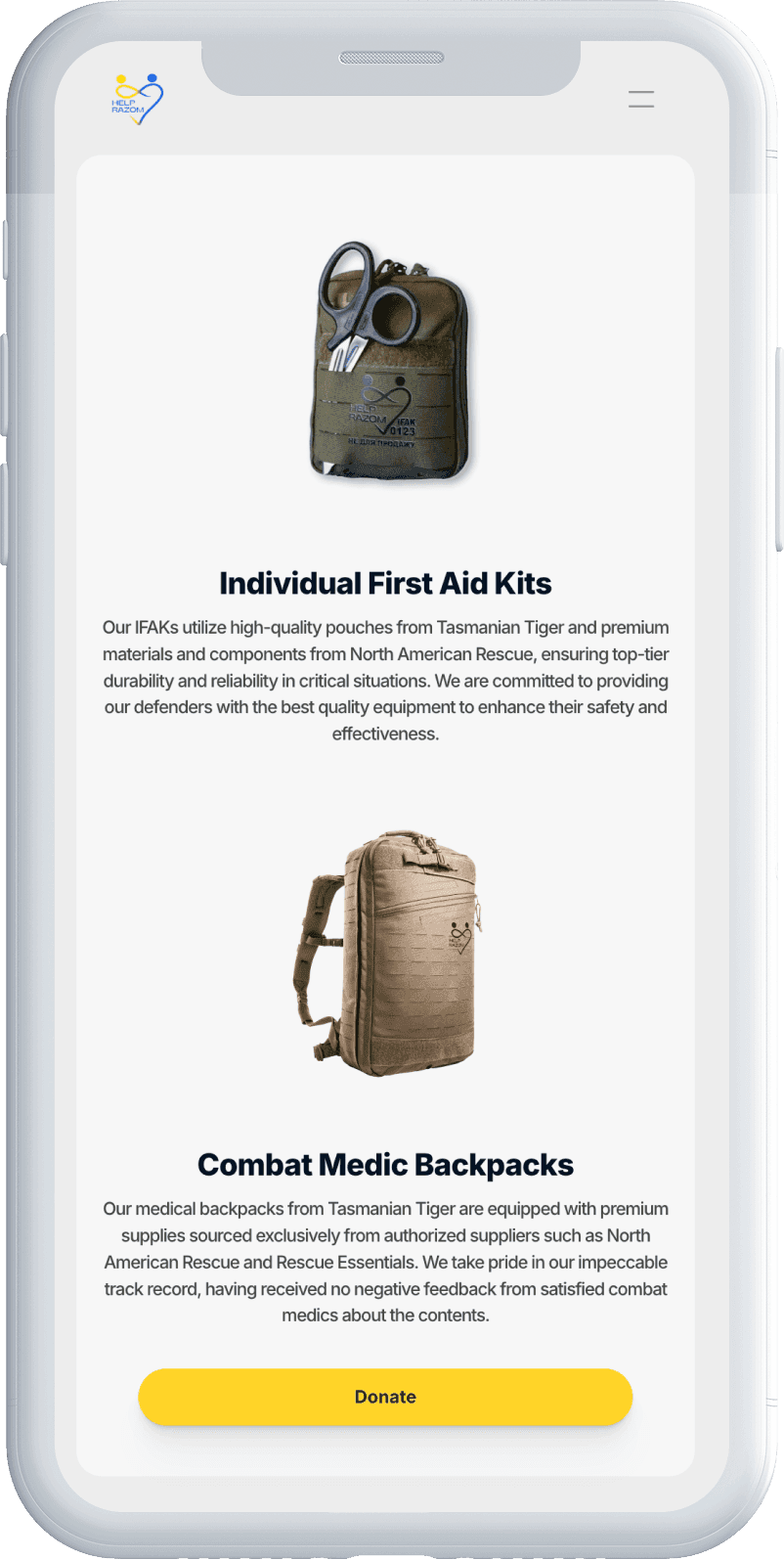
Examples of the IFAKs and Medic Backpacks that are assembled.
Recurring giving as a trust outcome
Supporters asked for a way to donate on a schedule instead of remembering each time. The first version offered weekly-only recurring at prefixed amounts ($10, $20, $50, $100) through Square's subscriber portal. The prefixed options worked, but they were limiting. When I opened it up to custom amounts and added biweekly and monthly frequencies, donors started giving in patterns I hadn't anticipated: odd amounts tied to personal budgets, biweekly schedules matching pay cycles, monthly gifts at higher amounts. The flexibility let people give on their own terms instead of picking the closest preset.
The retention pattern is the strongest evidence that the trust system works. Roughly 50 weekly subscribers who started in 2022 are still active as of early 2026 (Square subscriber dashboard). Subscribers who joined from June 2022 onward have an average lifetime contribution of $808, with top individuals at $7,000 to $13,500+. People don't set up recurring payments to an organization they don't trust, and they don't keep paying for four years if that trust erodes.
Building for handoff
Making the site run without a designer
The first platform, Square Online, went live in a week because it was the fastest path to accepting money. It worked, but it couldn't support Ukrainian language content, and the design was locked to Square's templates. I migrated to Weblium for bilingual support and more design control, which carried the org through its first year of growth. But Weblium still required me for every page change, and by the end of that year campaign launches were getting delayed because every content update flowed through one person.
I evaluated Framer, Webflow, and WordPress. Framer won because its editor works like Figma (fast for me to build in) and its content layer is simple enough for non-technical volunteers to use without breaking layouts. I structured the site so the most frequently changing content (active fundraisers on the homepage, partner listings, event details, campaign copy) lives in isolated components on the Framer canvas. Volunteers edit these directly and see the result immediately. The site's content types are simple enough that a CMS would have added complexity without adding value.
I recorded screen-share walkthroughs showing volunteers how to swap fundraisers, update goals, and add new partners. Part of the thinking was volunteer retention: keeping motivated people meant giving them tools that didn't feel like extra work on top of their actual responsibilities. Three volunteers now handle day-to-day content updates independently.

Week 1: Bare-bones Square Online storefront. Donations flowing, but no campaign structure, no language support, no design control.
Current: Campaign-specific fundraisers, volunteer-managed content. Two volunteers operate this independently.
Results
What the platform delivered
All metrics below are from Square dashboards, counting only donations processed through the website. Measured as of early 2026.
$500K+
Donations processed
Combined Stripe and Square, web campaigns only. Does not include offline donations, Zelle, or PayPal transfers.
$808
Avg. subscriber lifetime value
Among subscribers active since June 2022 (Square data). Top individuals: $7,000–$13,500+.
1,500+
Unique donors
Individual donors who contributed through the platform at least once.
4+
Years operational
Platform launched March 2022. Still live, still processing donations, still maintained by the team.
Reflection
What I took away from this project
What I'd do differently
Move to a volunteer-manageable platform sooner. Content updates bottlenecked through a single person for over a year. I delayed the Framer migration because building campaign pages felt more urgent than rebuilding the platform. But the compounding cost of that bottleneck (delayed campaign launches, slow content updates) was higher than the migration cost would have been. In hindsight, month six would have been the right time.
Question defaults even when they're industry standard. I launched recurring donations with prefixed amounts and weekly-only frequency because that's how most donation platforms structure it. The data showed donors wanted to give amounts and on schedules I hadn't predicted. The rigid presets weren't simplifying the decision, they were constraining it. I would have caught this faster if I'd launched with custom amounts from the start and used the data to see if presets were even necessary.

Product Design
Research
B2B
Wholesale
Designed a wholesale portal that scaled ordering beyond phone capacity – 100+ dealerships now self-serve. The program scaled without adding headcount.

B2C
UX/UI Design
Creative Direction
Strategy
Turned a high-ranking site into a high-converting one. Rebuilt the information architecture, redesigned user flows, and directed all new visuals. Increased conversion by 54%, cut bounce rate by 31%, and kept top Google rankings.
